Introduction
Sweet Spot is your hardest-working daily ritual: a candy-colored capsule that checks the box for freshness, balance, and confidence — and activates the version of you that doesn’t whisper.
Everyone thinks about this. Nobody talks about it. We do. Loud, juicy, a wink. The Red Bull of self-care.
Positioning
In the long term, this helps you decide. In the short term, it is the brief.
Confidence that tastes good.
Taste The Sweet Spot is the daily intimate-wellness capsule for people who want chemistry without the pharmacy hush. We take a time-tested locker-room rumor (pineapple) and turn it into a product you can actually take.
Happy Viking’s archetype was The Sidekick. Ours is closer to the loud friend who says it first. We don’t hide behind the Hero. We are the jolt.
Brand personality
Communicates the leap it takes to say this out loud, and the strength to keep taking it.
We synthesize the science so the customer doesn’t have to. Facts live on the back panel.
No one is perfect and every day looks different. We’re here for the stories, not the shame.
It’s in the name. Good vibes are the product. We go out of our way to share them.
Brand values
The better you take care of the chemistry, the better you show up. Capsules are bright yellow. Pack is Soona-true.
Believe you’ll win the day. We share that morsel of optimism every chance we get.
Health looks different for everyone. Freshness, balance, confidence — not a diagnosis.
Voice
Why voice matters
Our voice is punchy and potent. If there’s one thing this brand cannot be, it’s quiet. We unlock personal power — as fierce as a smirk, as subtle as the glow after water and a capsule.
We speak in first person plural. Copy comes with questions, pauses, smiles, surprises. Like talking to an expert on a commercial break. Real talking-out-loud stuff.
Our tone mantras
Keep it short. Punchy and powerful — not strict minimalism. Stay focused, have fun.
Numbers can be headlines. “Food” becomes “pineapple, cinnamon & cranberry.” Informative without over-explaining.
Candid, not careless. Uplifting, not toxic positivity. Powerful, not grind-culture.
Developing tone
Candid but not… careless · fluffy · blunt-cruel
Well-grounded but not… stodgy · science-y · overly dry
Uplifting but not… naive · sentimental · toxic positivity
Powerful but not… aggressive · intimidating · grind culture
Corny or cheesy. Sterile and austere. “Supports optimal vaginal microbiome pH.”
Locker-room volleyball banter that became a daily capsule. “Taste better down there.”
Always: fresh · balance · sweet · confidence · down there · chemistry · from the inside out · juicy · clean · pH-Friendly · #StayJuicy
Never: vagina (in ads) · odor problem · infection · cure/treat/diagnose · all natural · pH-Balanced · graphic/self-hate
Logo
The wordmark is the visual foundation of the brand and the most critical component of the system. Geometric letterforms, constructed like building blocks. White and black versions are balanced separately — don’t mix them up.

sweet spot
Sentence case. Archivo Black. Never all-caps on the wordmark (section titles in this book are the exception — that’s the Megazoid move). Never a new script. Pineapple seal stands alone only when the brand is already established.
Clear space
The minimum allowed clear space is based on the width of the “t” in taste. Exceed this where possible, especially near copy. Packaging is the exception — photography may sit closer.
sweet spot
Incorrect logo usage
Never flipped, twisted, or changed in a way that affects the original mark. Brand colors only. Clear space always.
sweet spot
sweet spot
sweet spot
sweet spot
sweet spot
sweet spot
Color
The palette is vibrant, bold, and inspired by the lineup — not a spa. Happy Viking anchored color in flavors. We anchor color in products.
Pair Her with pink. Him with blue. Wipes / wash wink with chartreuse. Colors from different “flavors” should not be mixed as two equal heroes except the Partner Pack split. When we want restraint: black and white.
Brand-book primaries
- HEX
- #FF00B4
- RGB
- 255 / 0 / 180
- CMYK
- 0 / 100 / 29 / 0
- HEX
- #00A8FF
- RGB
- 0 / 168 / 255
- CMYK
- 100 / 34 / 0 / 0
- HEX
- #D9E718
- RGB
- 217 / 231 / 24
- CMYK
- 6 / 0 / 90 / 9
- HEX
- #000000
- RGB
- 0 / 0 / 0
Secondaries
- HEX
- #FF59CE
- HEX
- #B3007E
- HEX
- #0076B3
- HEX
- #FFFFFF · #FAF7F5
Live tokens on tastethesweetspot.shop — also show these
The Next shop currently ships a slightly different set. Until we migrate, both are true. Don’t mix a book hex and a shop hex in one asset.
- HEX
- #FA009E
- Where
- .shop CSS
- HEX
- #0D56F9
- Where
- .shop CSS
- HEX
- #108474
- Where
- .shop wash / accents
- HEX
- #252525
- Where
- .shop body
Use white text over photography. Color text over photos only if white fails contrast and the image is similar in tone to that color’s pairing. Don’t pair Her pink with Him blue as two equal fields except the Partner Pack split. Don’t use gradients or mixed color fields.
Typography
Happy Viking used two faces: Megazoid (short, mighty, all-caps) and Aeonik (the workhorse). We have the same job — but the live sites currently ship different stacks. This chapter shows every face that is actually on tastethesweetspot.com and tastethesweetspot.shop, then the target book stack.
Live · tastethesweetspot.com (Shopify)
Instrument Sans
Shopify preloads Instrument Sans weights 500 and 700. Heading and body on .com are this one family. No Akshar, no Spline, no Figtree on the Shopify storefront as of this scrape.
ABCDEFGHIJKLMNOPQRSTUVWXYZ abcdefghijklmnopqrstuvwxyz 1234567890
Live · tastethesweetspot.shop (Next)
layout.tsx loads four Google faces. globals.css assigns roles. Caveat is imported for accents. Filson Pro + Kefir still exist as leftover Javy landing CSS — not brand, do not use on new work.
Do not specify for new brand work: Filson Pro, Kefir (Javy CS01 / LP51 leftovers on .shop). They are not Taste The Sweet Spot.
Target · this brand book
When we unify the two sites, this is the stack — Happy Viking’s Megazoid + Aeonik mapped onto faces we actually own on Google Fonts.
Two faces per asset, max. Archivo Black does not set paragraphs. Chartreuse is never body text.
Type tester · every live face, same line
Instrument Sans · .com
Spline Sans · .shop display
Akshar · .shop headings
Figtree · .shop body
Inter · .shop loaded / book body
Archivo Black · book display
Fraunces italic · book quote
Caveat · .shop + book wink
ABCDEFGHIJKLMNOPQRSTUVWXYZ
abcdefghijklmnopqrstuvwxyz
1234567890 . , ! ?
Visual devices
Happy Viking’s building blocks: geometric shapes as windows for photography, type as a block, rounded corners and a consistent gap. We steal the system. Our blocks are pink / blue / chartreuse / ink.
Simplicity is the rule. Limit the number of blocks to no more than three per composition.
How to
Step 1. Establish margins and grid.
Step 2. Create simple shapes along the grid — one or two blocks.
Step 3. Add messaging and imagery.
down there
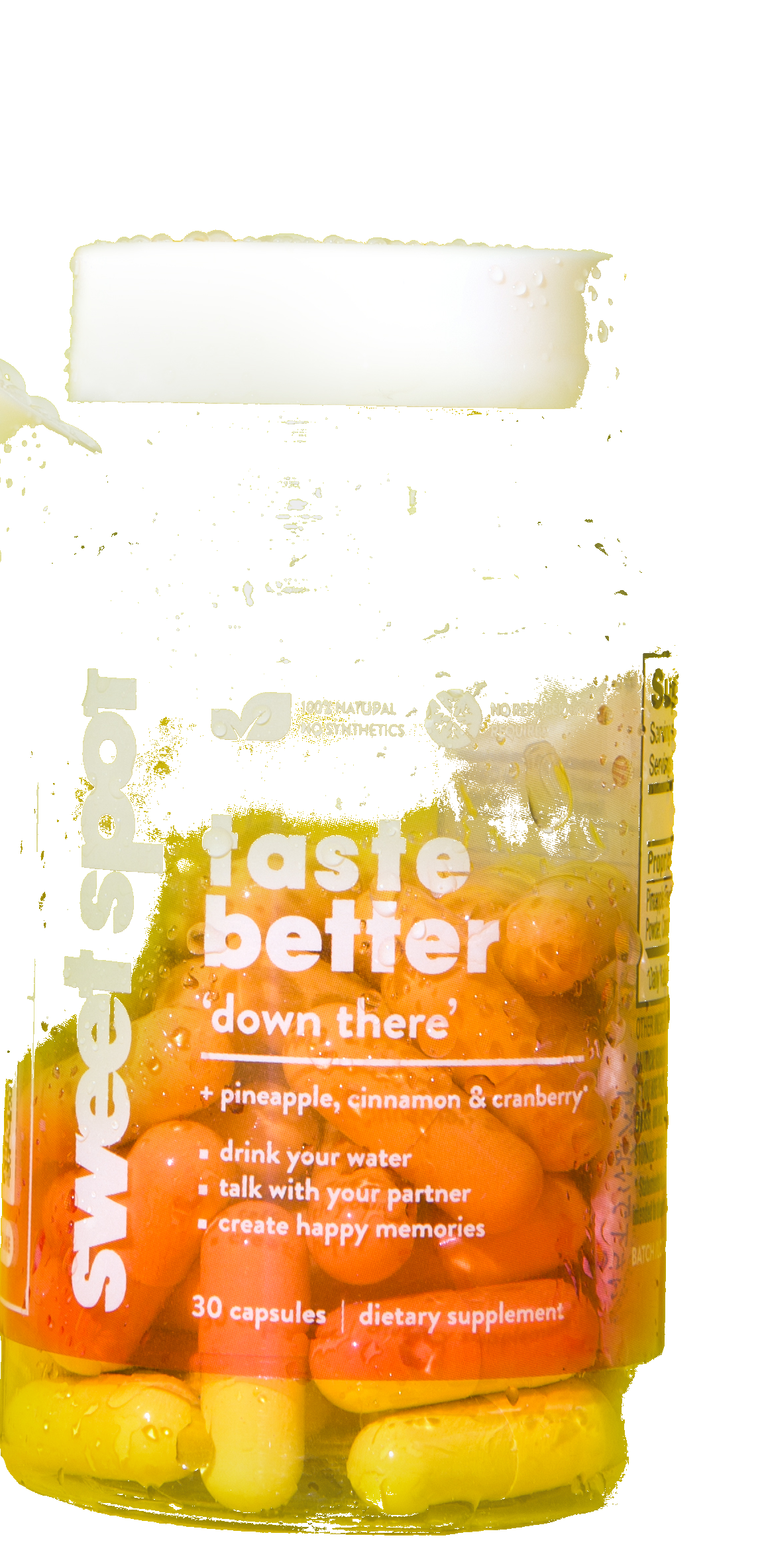
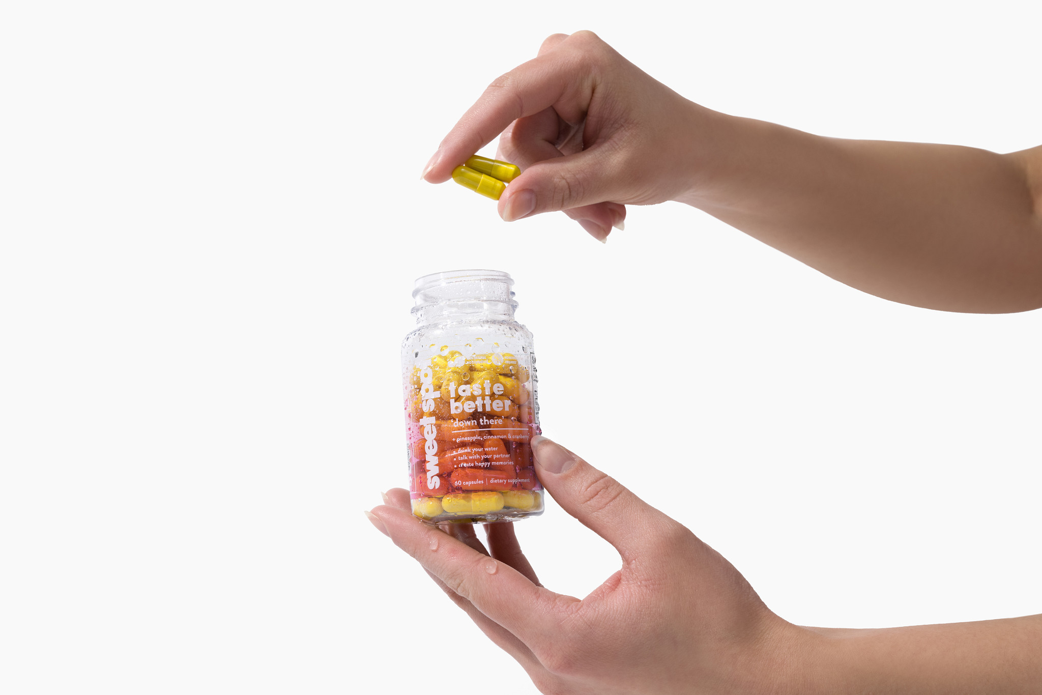
Rounded corners: neither too sharp nor too round (this book uses 22–28px). When two blocks sit next to each other, they are separated by a gap — here, 12px plus a 3px ink stroke. Keep stroke and radius consistent across mobile, digital, and print.
Photography
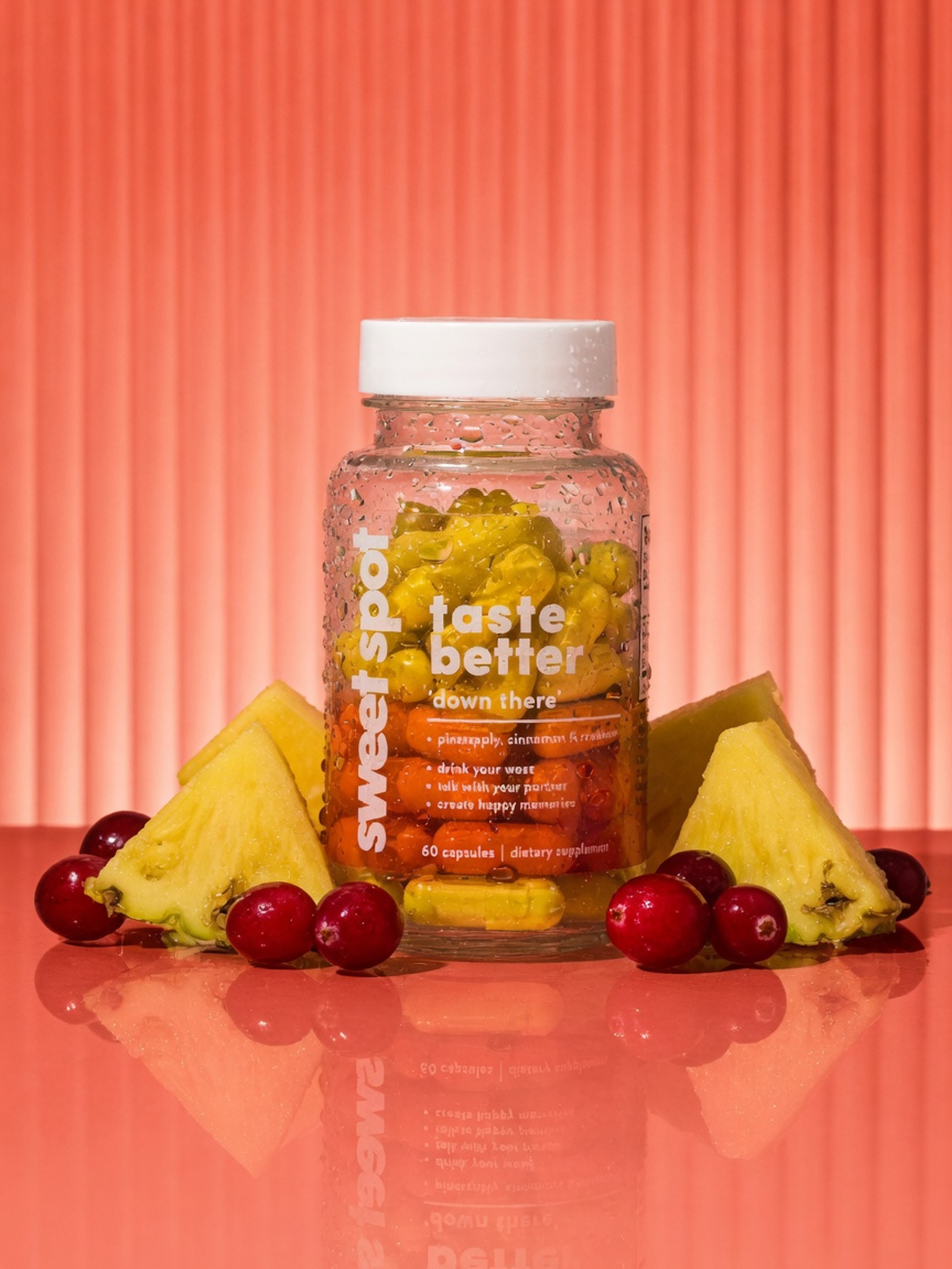
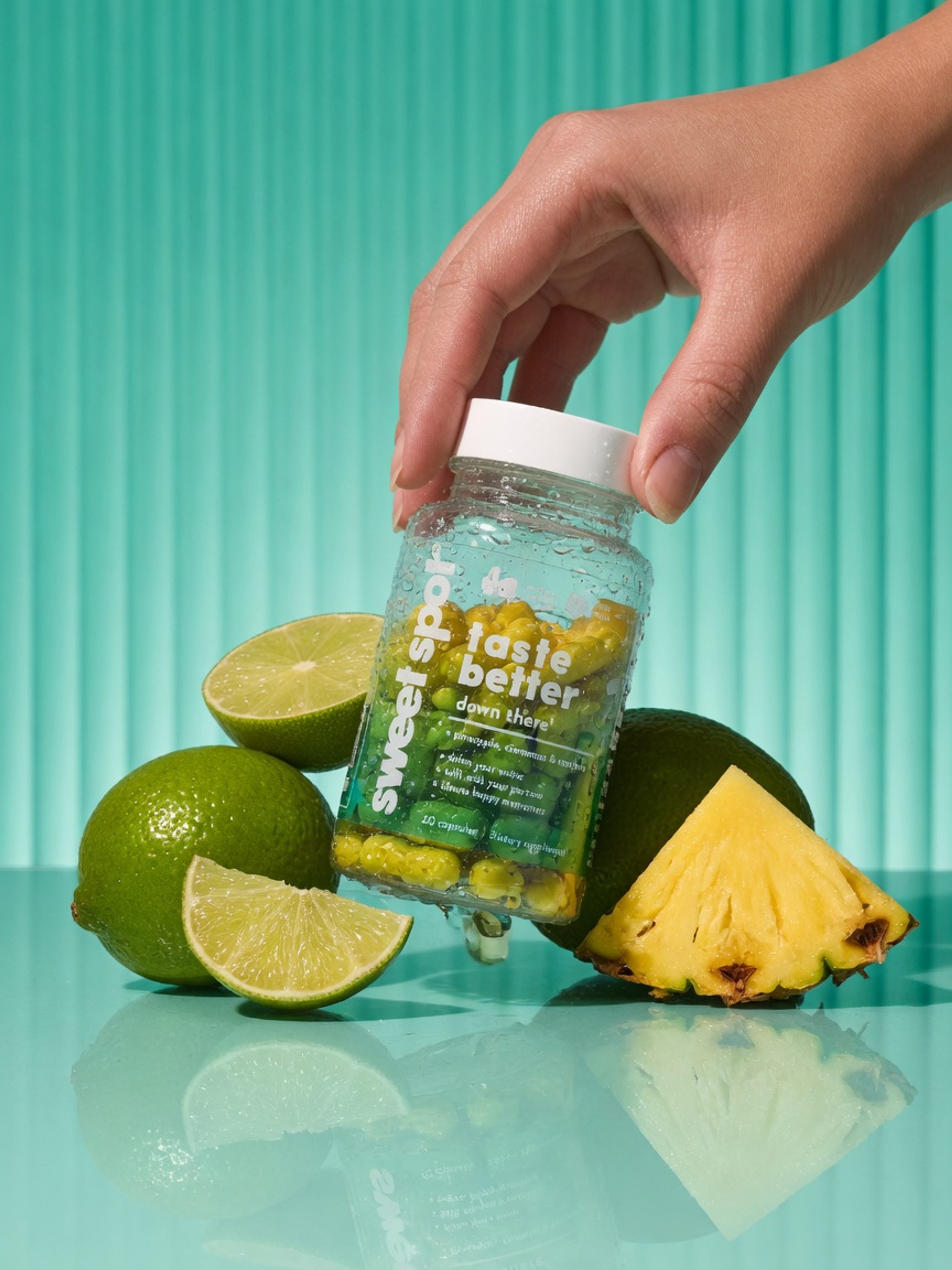
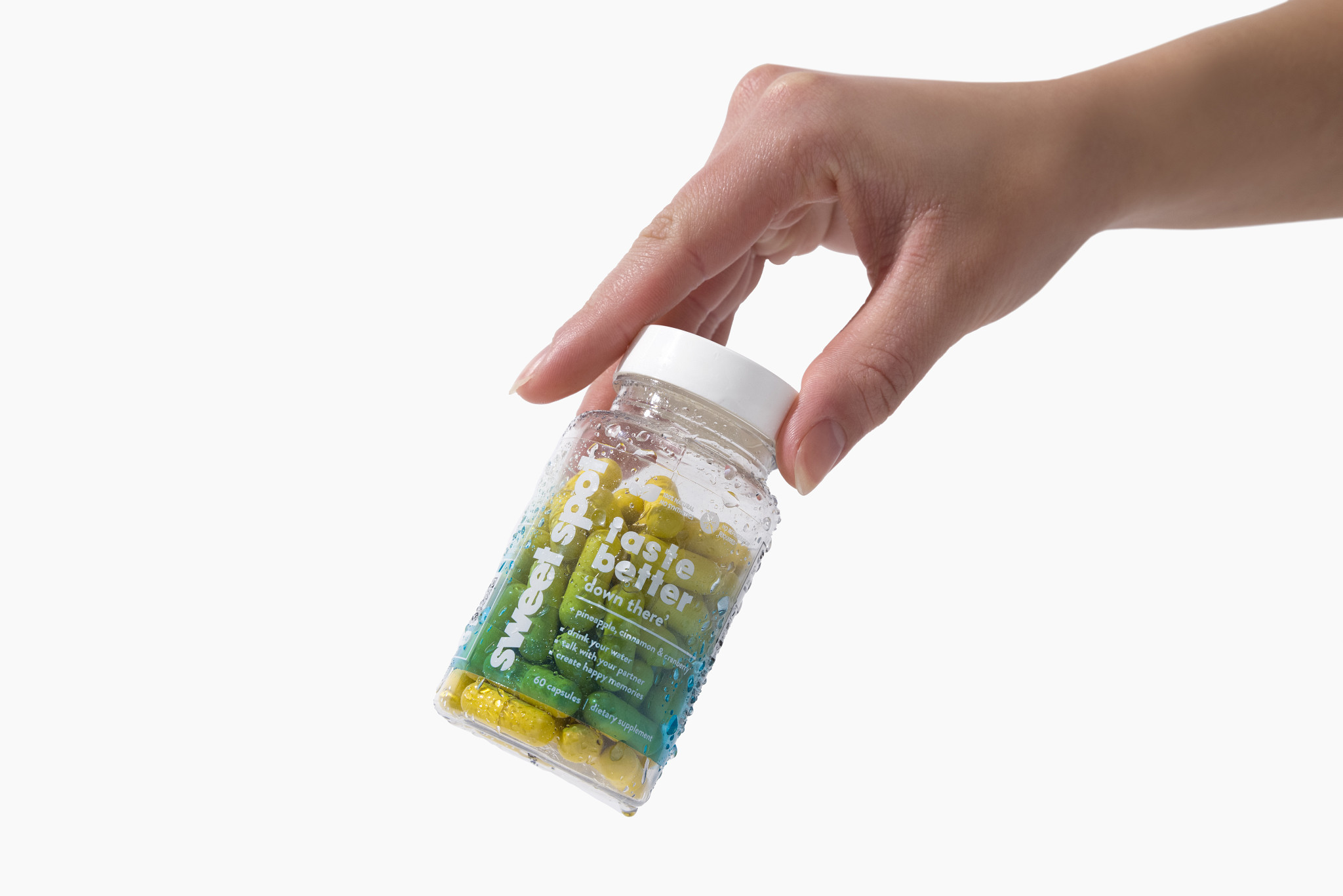
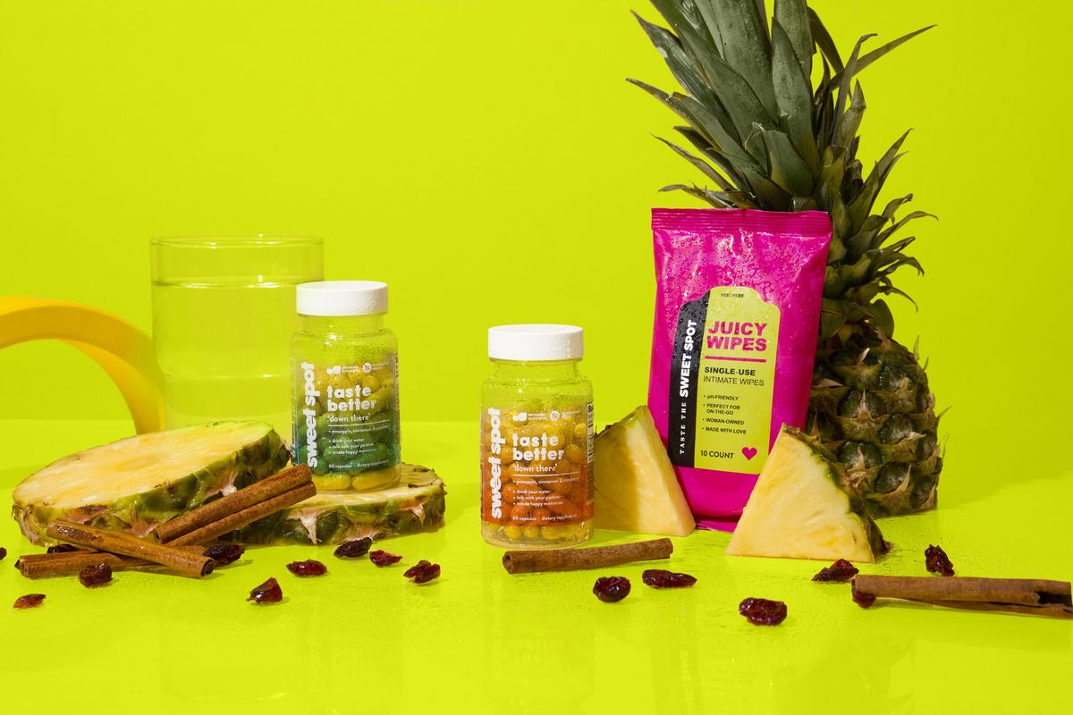
Bright, bold, optimistic. Strong contrast. Minimal styling. Product against simple fields. People captured in the moment — on or off the court, at the sink, in full sun.
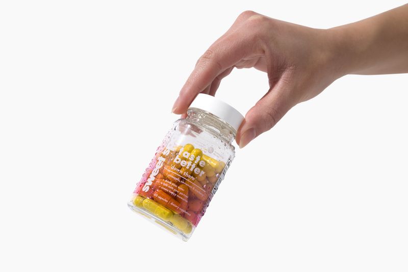
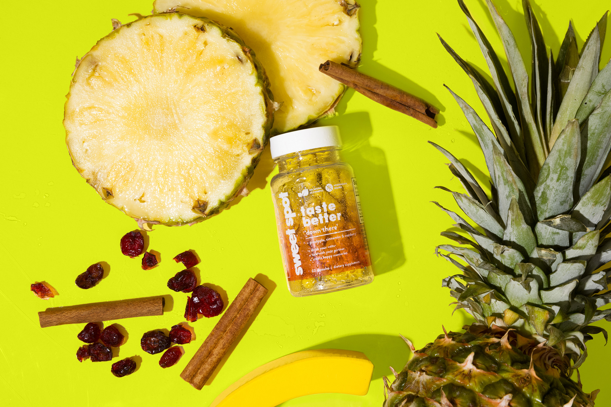
Settings: in the bathroom · amongst fruit and ice · outside in daylight · against simple color fields. Not cheesy. Not clinical. Not overcast.
Packaging
Packaging is where type, logo, and photography come together into a heroic, proud presence. Big identity, photography module, flavor/product color. Format stays consistent; color and product shot change.
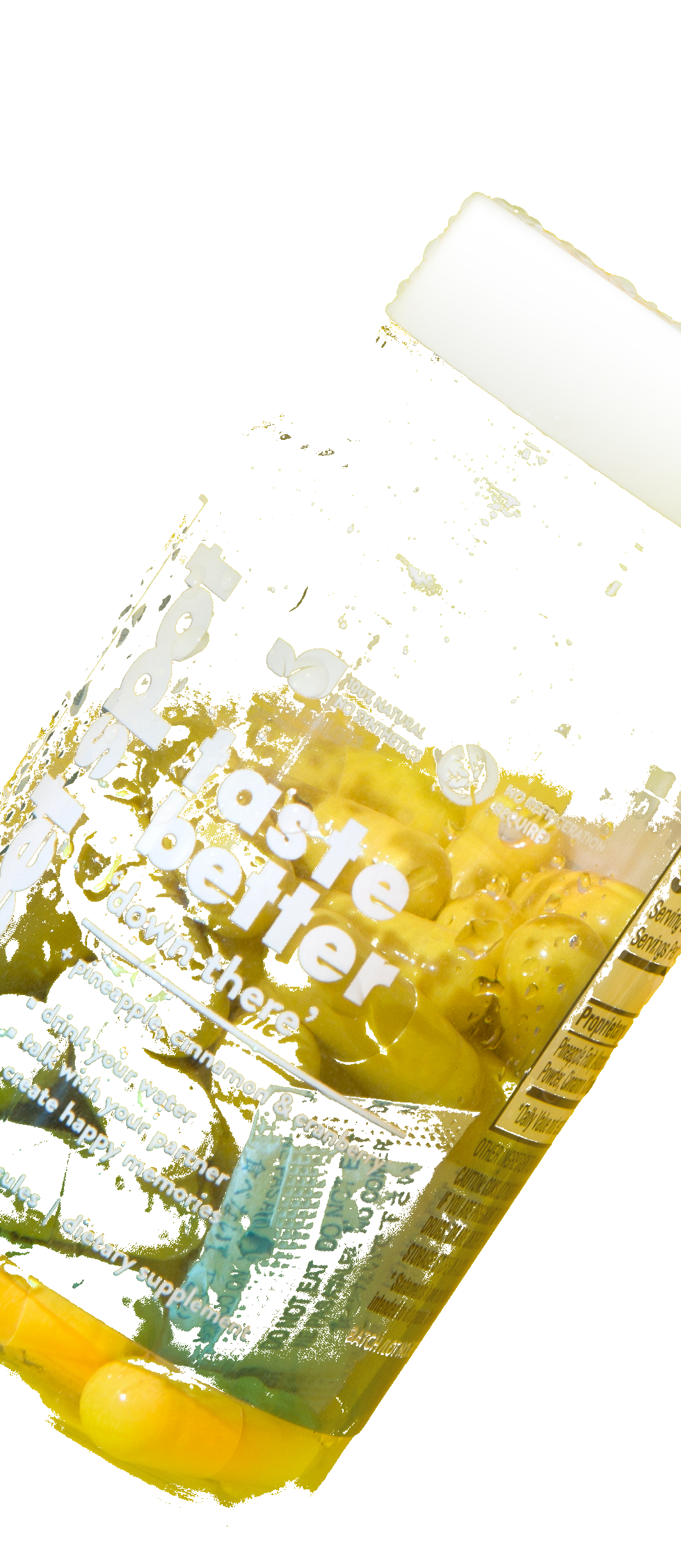
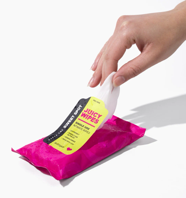
Front = desire. Back = facts. Direct-print energy-can energy going forward. Shoot the cyan wash as-is. NET WT. as on pack.
Applications
Type, logo, blocks, and photography working together. If a layout needs more than three blocks, cut.
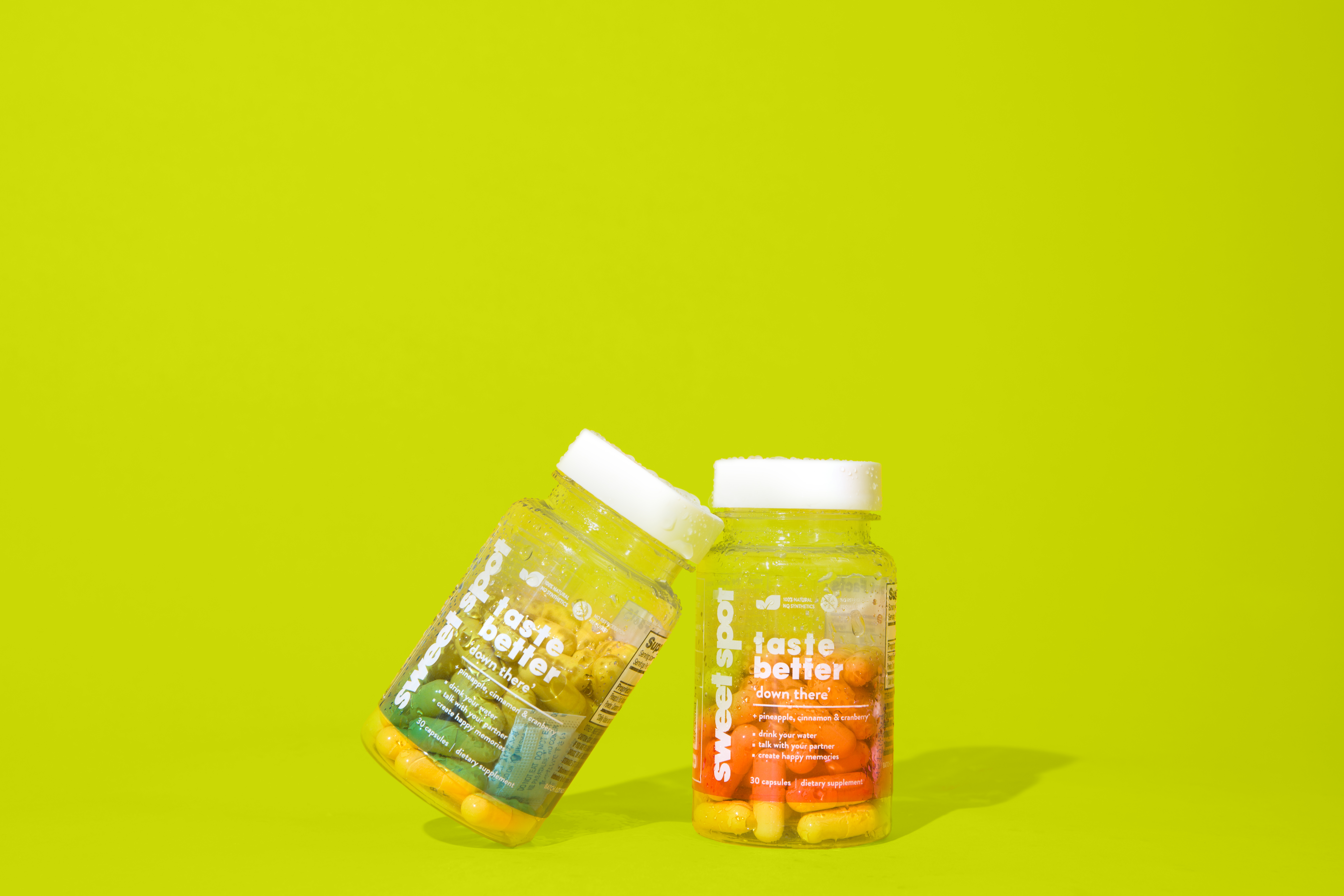
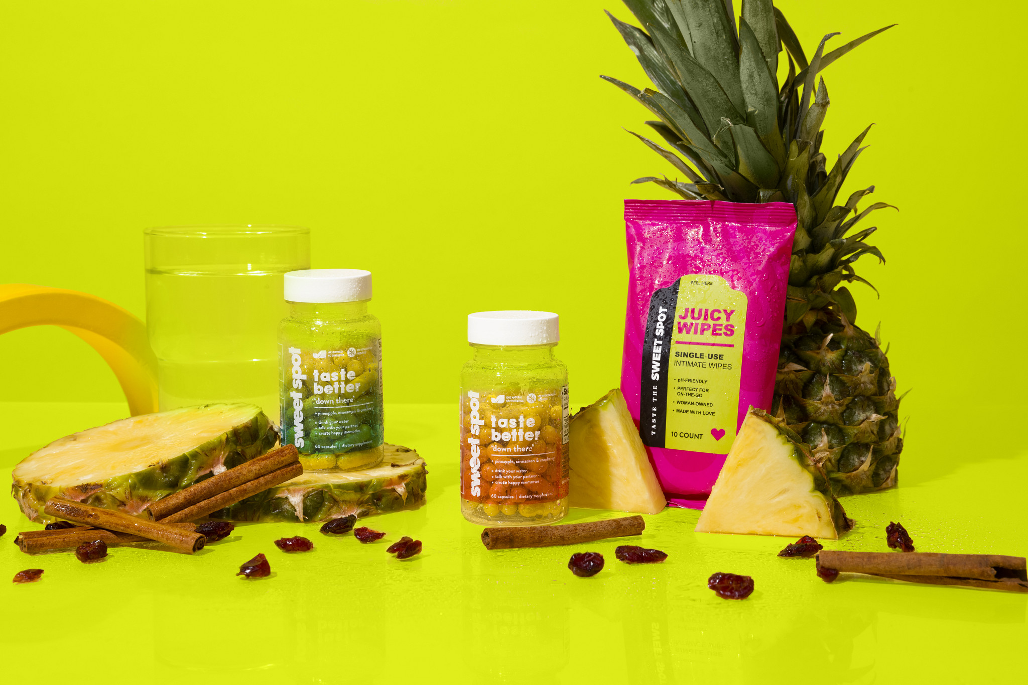
Win the day.
Does this feel like a jolt — or a quiet supplement aisle? If it’s the aisle, push color, texture, or the line until it isn’t.